By Jon-Mikel Bailey, {grow} Community Member
Have you ever visited a website based on the promise of great content and … what a dump?!? Did you even read the content after the first impression?
Content in and of itself is not the complete picture. Design matters. Visuals matter. User experience matters!
Mark Schaefer talks about this in The Content Code![]() : “If your site looks trashy … well … it might be time for a refresh!”
: “If your site looks trashy … well … it might be time for a refresh!”
People make subconscious decisions based on the first things they see. You have nanoseconds before these decisions are made. Your content is judged before it’s even read!
And as the user reads it, design still plays a huge part in keeping their interest and ensuring they take the next step.
So, how can you use design to reinforce the perceived value of your content? Let’s look at this in three parts:
- Responsive Design
- Content Flow
- The Next Step
Responsive Design
Most folks hear responsive design and immediately think “mobile.” I still like this definition from Smashing Magazine:
“Responsive Web design is the approach that suggests that design and development should respond to the user’s behavior and environment based on screen size, platform and orientation.
“The practice consists of a mix of flexible grids and layouts, images and an intelligent use of CSS media queries.”
Look at the words themselves – responsive design…
Your website is designed and coded to respond to the needs of the user – whether on mobile, tablet, desktop, or mammoth desktop.
Responsive design is an ideal delivery system for your amazing content. Designing your website for various breakpoints – desktop, tablet, mobile – means that each reader is presented content in the ideal format for them at that time.
The stakes are now even higher. If your site stinks on mobile, you’re not only fighting frustrated readers, but also Google! Google has implemented a new algorithm that penalizes sites it considers unfriendly to mobile devices. So, there’s that.

But, what about someone on a large tablet? Or a laptop? Or a large monitor in an office? …Multiple monitors?
Instead of reacting to a Google Algorithm change, proactively design for your audience, wherever they are. Your layout should change for screen size and orientation (landscape vs. portrait).
If the user isn’t distracted by the design (and how terrible it is), they can focus on your content.
Content Flow
The wrapper of your content is important, but so is the content itself… visually. You might be thinking, “these are words, how do I design words?”
<quick rant>
Because websites today are fluid, you have little control over how your text will display on the screen. Sure, you can set up styles sheets to control fonts, color, etc. But, don’t get hung up on a widow, orphan, or try to fully justify everything (terrible for digital, leave this to the newspapers)
This is not a printed book or magazine. This is digital content. Get your OCD in check and accept that your content will appear differently for just about every person who sees it. Control what you can and let everything else go.
Let go. Let your content breathe. Give it space to move and fill the screen naturally.
</quick rant>
OK, off my soapbox.
Your content needs to be readable. You’re dealing with a very distracted audience… Facebook, emails, phone calls, texts, SQUIRREL!
Your content should be scanable (which isn’t a word but should be). Here are some good guidelines for digital content:
- Use heading tags instead of just bolding headlines – H1, H2, H3 in HTML. This does two important things:
- Visually designates that content as being important, worthy of attention.
- Tells the search engines what the following content is about – use keywords but make sure it still makes sense to the reader.
- Have a clear opening. A long, drawn-out setup is going to frustrate the reader. Get right to the point.
- Write in short paragraphs and lists – reading on a screen or device is difficult. A long blocky paragraph looks like a daunting and exhausting task ahead for the reader. Break things up into smaller chunks. Just like this bullet point.
- Break the information up further with images, charts, graphics, etc.
Pay attention to popular blogs, like this one. Take note of the content flow and borrow formatting styles that would work well for your audience.
The Next Step
Don’t leave them hanging. Your content should have an obvious end point. All good content should result in some sort of action, such as:
- Comment
- Share
- Signup for something
- Buy something
- Download something
Now, you can ask for these things in the written conclusion of the content, as you should. But, is there more you can do here?
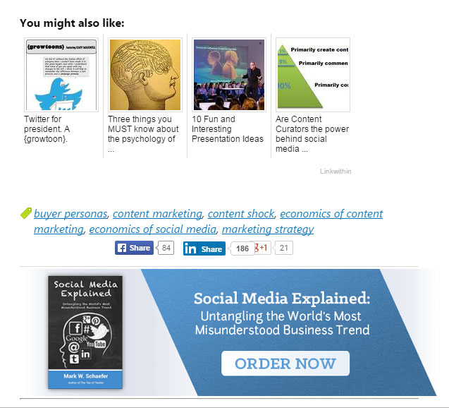
Of course there is. What about a visual call to action. For example, this blog offers you related posts with pics as well as a book to purchase …
There’s another reason to know what your next step(s) will be for the reader. Sure, you want them to take action, but can a shiny graphic alone do this?
In a way, all of the steps leading up to this call to action were part of the sales process:
- You convinced them to “come on it” with good, responsive design, and easy to read content.
- You kept them in the store with great content. So much so that they wanted more… like another post or a book!
If you know that you want the reader to do more than just read it will motivate you to give them your best!
We’ve come to the end of my post. What do you think? Think design matters? Is content enough? I want to hear from you!
Let’s talk about this more in the comments section below!
 Jon-Mikel Bailey is President, Wood Street, Inc. Before co-founding Wood Street in 2002, Jon worked in sales, marketing and business development for technology and marketing firms. A popular speaker, he gives seminars on digital marketing and design to chambers of commerce, trade associations and colleges. Connect with Jon on Twitter, Facebook, LinkedIn, and Google+.
Illustration Courtesy Flickr CC and Phil Hearing