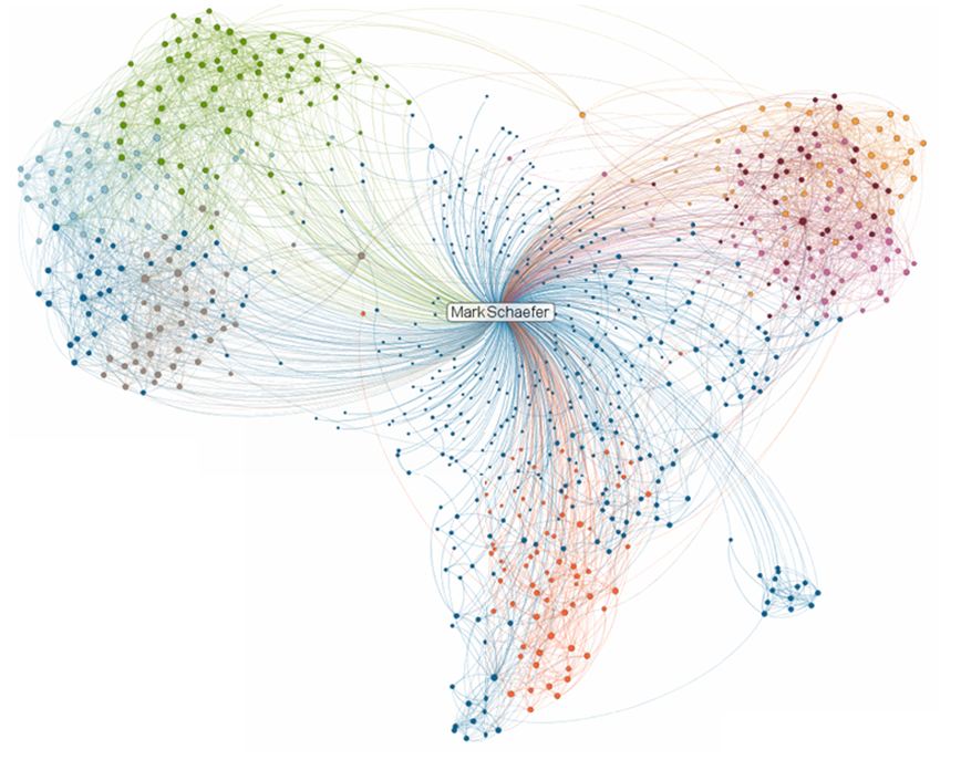
Don’t you think these bizarre new media “visualizations” have gone too far? The picture above is not a map of Africa on Acid, it’s a new LinkedIn product called InMaps. Here is how the company describes it:
“InMaps is an interactive visual representation of your professional universe. With it you can better leverage your professional network to help pass along job opportunities, seek professional advice, gather insights, and more.”
Here is my official review of it: “Bite me.”
I am so sick of “info-graphics” that make you work for information. Will somebody please hand me a freaking pie chart so I can soothe myself? What am I supposed to learn from this ridiculous LinkedIn cotton candy butterfly?
Now in all fairness, this illustration does not give credit to the interactive majesty of the real thing. If I hover over a nodule I get somebody’s face. So I all day long I can decorate my butterfly with little pictures of my friends.
Isn’t there anybody at LinkedIn who is thinking “Ya know, this is really dumb. We’re about to embarrass ourselves.”

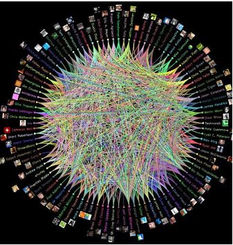
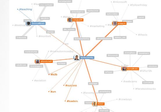
And let’s not forget the popularity of nodes. When new media really wants to create a chart with impact they node-ify it. Like this example, they usually put the user in the middle, creating a Zen-like chart that shouts “YES! In fact the world DOES revolve around you. That’s why we’re on social media in the first place, right?
At the end of the day, we have simply forgotten how to properly display information. The medium is obscuring the message. Let me demonstrate what a real “info-graphic” is supposed to look like:
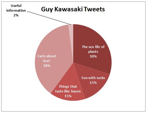
For you new media types, I would like to introduce another innovation called the “bar chart.” No nodes, no butterflies, just good ol’ helpful data:
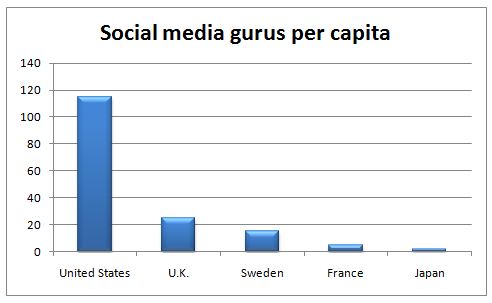
I hope this lesson in displaying data will help all of you realize that it’s time to return to a simpler life, when we could use statistics to lie about our companies in ways everyone could understand.
I for one have had enough. I’m beginning a new non-profit organization called Better Information Through Charts and Histograms, or BITCH for short. Please join me, won’t you? Give generously so that I may continue my efforts to stamp out clouds and spyrograph thingys.
Remember my dear friends, before you make a pitch, send money to BITCH.
